Dev Changelog

Keep up to date with all the upgrades, changes and bug fixes on Direct.me

Multiple pages & a community map

Hey — big one for keeping your Direct.me organised. VIP creators can split their profile into multiple pages now (think Home, Shop, Links), and fans can drop pins on a Community Map. Here's what's live.

New
  • Multiple profile pages (VIP) — create extra pages on your profile with their own blocks and a simple menu up top, so shop, links, and everything else don't have to fight for the same scroll
  • Page menu alignment — left, center, or right for those page tabs, so the menu lines up with the rest of your layout
  • Community Map block — invite followers to drop a pin and show where your community is on a shared map
  • Realtor Lead Gen block — capture local leads right from your page if you're in real estate
  • Official Links block — highlight verified social profiles in one clean block
Updated
  • Delete a page with a clear choice — move its blocks to Home, or remove them with the page
  • Direct.me badge — cleaner copy and spacing on the brand mark
Tom

Tom

Founder & CEO

Folders, new blocks, and a calmer editor

Hey — we've been busy making your page easier to organise and a bit more fun to build. You can group stuff into folders now, drop in maps and tour dates, and the editor's got clearer next steps and icons so it doesn't feel like a wall of mystery blocks. Earnings and selling got some love too. Here's what's new.

New
  • Folders for your page — group blocks into a folder, open it on your profile like a section, and manage what's inside from the editor (move a few items at once, reorder, pull things in or out)
  • Map block — put a map on your profile so people can find you, your venue, or your next stop
  • Tour Dates block — list upcoming shows and dates in one clean block instead of a pile of separate links
  • Files block — share downloads and documents from your page in a proper files section
  • Simple one-off blocks — add a single link, a single file, or a single video without spinning up a whole multi-item block
  • Editor checklist / next steps — gentle prompts for what to do next (photo, links, payments, and so on) so a blank page doesn't feel stuck
  • A clearer Add to page hub — browse and add blocks from one place instead of hunting around
  • Colourful type icons on every block in the editor so you can scan your layout at a glance
  • More profile themes and looks — including landscape cut-out, charity, event-style, and avatar-hero vibes if you want a fresh feel without redesigning from scratch
  • A heads-up when you add OnlyFans / Fansly-style links, so you're not surprised by how they show
  • Lock icons on protected social icons so it's obvious which ones are gated
Updated
  • Earnings — see recurring subscription income and a clearer breakdown of what your blocks are bringing in
  • Navigation — easier mobile More menu and a clearer path to Income
  • Selling in more currencies — product and checkout pricing can follow the currency that fits your audience
  • Media Kit sits behind VIP with a proper upgrade path, so pro tools stay pro
  • Contact block on your profile matches the look of your other items more cleanly
Tom

Tom

Founder & CEO

New ways to show what you make

Hey — bunch of stuff for people who treat their Direct.me like the real front door: what you sell, what you post, and the thing you're pushing right now. No waitlists — it's live. Skim the sections below.

Your page should feel like you — not a dusty link list. Here's a handful of new ways to make that obvious.

Show what you sell

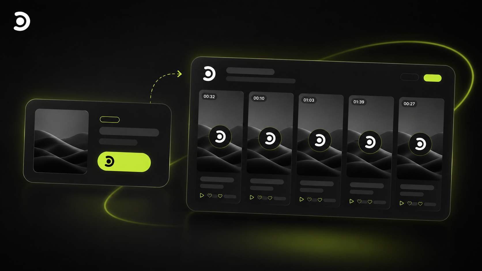
Products block

Merch, digital files, a preorder, a service, or just a few things you want eyes on — the Products block is a proper storefront moment on your page. Price it in the currency that matches your audience, lay it out in a grid or carousel, and let people shop the story you're already telling.

Bring TikTok into the same story

TikTok block

Short-form shouldn't live in a silo next to your bio link. The TikTok block sits your latest work beside everything else — drops, longer videos, tickets, the link in your IG — so fans get one picture of who you are.

One link for the drop

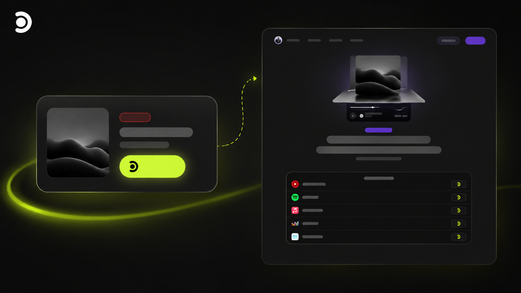
Track block

The Track block is built around how artists actually ship audio: cover art, a sharp line about the release, outbound buttons to Spotify, Apple Music, or wherever you're live, and optional preview playback so people hear it on your page first. You get the hero card on your profile and a full listen page behind it — one URL that feels worth sending when the thing goes live, not another generic landing.

A bolder cut-out look

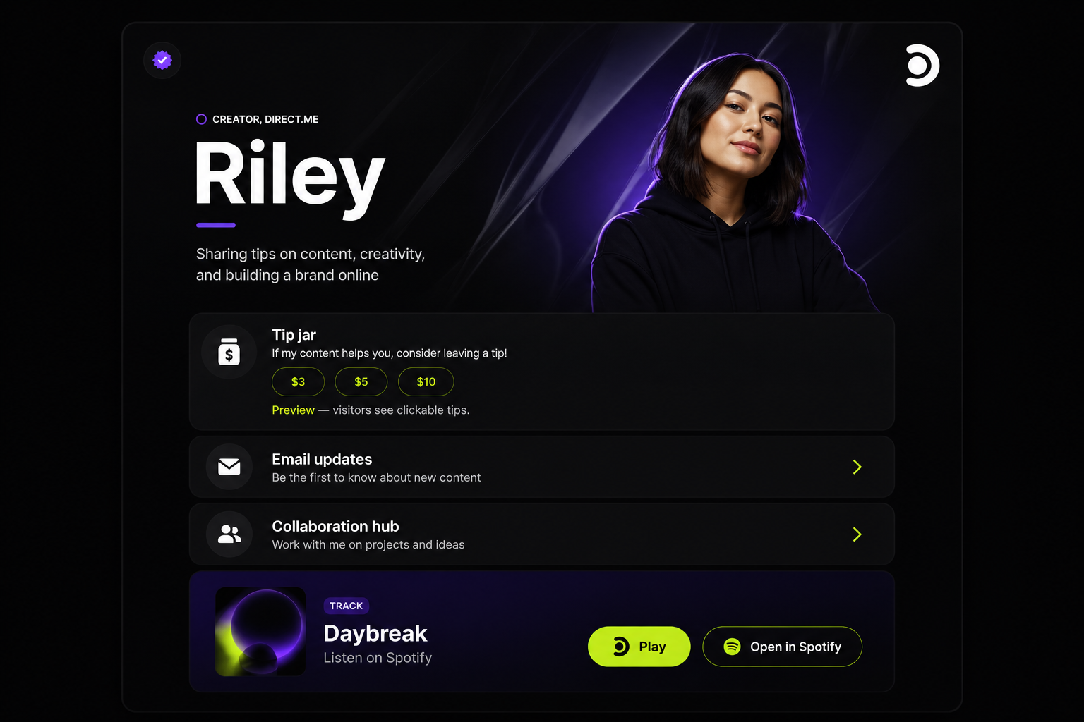
CutOut Hero theme

If you're after a page that reads more like a spread than a bullet list, CutOut Hero is a new theme built around a strong cut-out, editorial feel — more depth, more presence, more 'this is obviously my brand.'

That's the core of this drop. If something doesn't hit the way you want once you've lived in it for a day, we're listening — send the note, send the screenshot, we actually read them.

Tom

Tom

Founder

More tools for creators

We've done a lot of improvements since the new dashboard went live. This update is about making Direct.me easier to move around, giving you more ways to show off your work, and starting to test bigger creator tools with a small group before we roll them out wider.

New
  • A new dashboard layout that makes it easier to jump into your page, analytics, earnings, short links, QR codes, tools, support, and the things you use most
  • Spotify track embeds so visitors can play a featured song directly from your Direct.me
  • Spotify playlist embeds so you can share a full playlist on your page
  • Spotify artist embeds so musicians and creators can send visitors straight into an artist profile
  • Spotify episode embeds so podcasters can feature a specific episode
  • Spotify podcast embeds so visitors can discover and follow a full show
  • New profile themes, including Wave and Electric Rise, with more visual, motion-led designs
  • MediaKit is now in testing with select creators, including public media kits, audience stats, contact enquiries, and controlled access options
  • A new brand deal pricing calculator to help creators estimate sponsored post, reel, TikTok, YouTube, usage rights, and exclusivity rates
Updated
  • Dashboard analytics now surface the numbers creators care about more clearly, including views, clicks, CTR, revenue, and recent activity
  • New creator setup screens are cleaner and easier to follow, so getting your page ready takes fewer decisions at once
  • Profile images and public page visuals have been sharpened so creator pages and MediaKit previews look cleaner
Tom

Tom

Founder & CEO

A new dashboard for creators

This is one of those updates I've wanted to share for a while. We have a brand new dashboard, and alongside it we're launching two completely new ways to share your Direct.me: short links and QR codes. The goal is simple: make it easier to see what's happening, share the right thing quickly, and get your page in front of more people wherever you meet them.

I think a good creator tool should quietly help you move faster. It should not make you hunt around, second-guess where things live, or feel like you need to learn a bunch of new words just to share your work.

That's the thinking behind the new dashboard. We wanted it to feel like a proper home base: the first place you go when you want to see how your page is doing, make a quick change, or share something with your audience.

But this update is bigger than a cleaner dashboard. Short links and QR codes are brand new features for Direct.me, and they open up a much easier way to share your page in the places you already show up.

The biggest changes are simple, but they matter:

  • A clearer dashboard - a cleaner space to understand what's going on with your Direct.me, without the clutter.
  • New short links - create neat, easy-to-share links for the places you want to send people. Perfect for bios, posts, messages, flyers, podcasts, or anywhere a long link feels messy.
  • New QR codes - create codes people can scan straight from a phone, so your Direct.me can travel into the real world too: events, packaging, menus, business cards, posters, and more.
  • Quicker sharing - the tools you need to get your page out there now live closer together, so you can spend less time setting things up and more time actually sharing.

What I like most about this update is that it meets creators where they already are. Sometimes you're online, posting and sending links. Sometimes you're at a booth, in a shop, on stage, at a class, or meeting someone in person. Your Direct.me should work in all of those moments.

This is also the beginning of a bigger direction for the dashboard. We want it to become the place that helps you understand what's working, spot opportunities, and take the next step without needing a marketing degree or a spreadsheet open.

As always, we'll keep listening and shaping it from real use. If something feels useful, we will make it better. If something feels noisy, we will simplify it. The goal is the same as ever: help you show up well, share easily, and grow in a way that feels like you.

Tom

Tom

Founder

A fresh start for support

Support is an area I've felt, personally, we've never quite got right. Tickets fell through the cracks, replies got lost, and when people needed us most they couldn't always reach us. So we've stripped the whole thing back and built a new, simple tool from scratch — one job: make sure you can get help when you need it.

The old support flow had too many surfaces — inboxes, forms, chat widgets, email threads — and things would slip between them. That's on me. I want this to be one of the best parts of using Direct.me, not one of the weakest.

So we rebuilt it. One place to open a ticket, one place to see every reply, and notifications that actually land in your inbox with a button that takes you straight back to the thread.

A few things I want to call out:

  • One simple place — /support is now the only place you need. Start a ticket, reply to ours, see where things are at.
  • You get prioritised by plan — Verified and VIP creators jump the queue automatically, because if you're paying us we should be there first.
  • Email that works both ways — when our team replies you get a clean email with an Open ticket button. Reply on the site, reply from email — either way the thread stays together.
  • Guests aren't forgotten — you can now open a ticket without an account, and we'll send you a magic link to track it without needing to log in.
  • No more ghost tickets — every message is tied to a ticket with a status, so nothing sits in a queue we forgot existed.

This is the foundation. I'd rather have a small tool that actually works than a big one that doesn't, so we'll grow it from here based on what you tell us. If you hit us up in the next few weeks, you'll be helping shape it — genuinely.

— Tom

Tom

Tom

Founder

Search for links in the Links block

Adding links just got easier. You can now search the web from right inside your Links block and add results with one click—no more copying and pasting from your browser.

Next to the usual Add New Link button you'll see a Search button. Hit it, type your name or whatever you're looking for (like your Instagram, your shop, or a recent article), and we'll go find it. The results show up with the page title and URL—you can tweak the title if you want before adding. When you're done adding what you need, close the search and you're back in the editor with all your new links there.

We also try to pick an icon for each link when we recognise the site (Instagram, YouTube, your website, and loads of others), so your link often looks the part without any extra steps.

Tom

Tom

Founder

Link in Bio for Realtors

We've put together a ready-made collection for real estate professionals. One place to grab everything you need for a sharp, client-friendly link-in-bio page.

If you're a realtor or agent, you can now install the whole set in one go. The collection includes blocks and a badge so your profile looks the part without the guesswork.

You get: a way to show off your current listings (with photos, price, and location), a featured listing block for your star property, an open house block for upcoming events (date, time, address, and a link to the listing), plus testimonials, a contact block, and FAQ so visitors can get answers quickly. There's also the Licensed Realtor badge you can turn on so your credentials are visible at a glance.

Install what you need, leave out what you don't. Your page, your mix.

View the Realtor collection →

Tom

Tom

Founder

New: Subscribe Block

Collect email subscribers directly on your profile with the new Subscribe block. One block, multiple ways to use it.

Add a Subscribe block to your profile and let visitors sign up for updates with their name and email. You can show it as an inline block, a floating button, or open a signup modal as soon as someone lands on your page.

Subscribers verify their email with a code, and you get a clean list of contacts you can message from Direct.me. Optional phone collection and a social icon in your links bar are there if you want them.

You can:

  • Place the block inline on your profile like any other block
  • Show a floating subscribe button (Intercom-style) that opens a modal
  • Optionally open the signup modal automatically when the page loads
  • Add a subscribe icon to your profile social/links bar
  • Collect name, email, and optionally phone
  • Customize the button and description text to match your voice

If you use the content warning (adult warning), the subscribe modal waits until visitors have confirmed before showing, so the flow stays in the right order.

Simple list building, no third-party forms required.

Tom

Tom

Founder

New: Tag Cloud

We've added a Tag Cloud block, and honestly… this one just makes sense.

It lets you show off what you're into - skills, interests, niches, topics - without dumping a wall of text on people. Think clean, scannable, and instantly understandable.

Add tags like Creator, Fitness, AI, Real Estate, whatever fits you. Give them icons if you want. Make them clickable if you want people to go somewhere. Or don't. You're in charge.

It's basically a modern take on old-school blog tag clouds - minus the ugly and plus actual control.

You can:

  • Reorder tags with drag & drop
  • Choose grid or list layouts
  • Adjust spacing, size, and alignment
  • Let it automatically match your theme (no fiddling required)

Drop it in once, tweak it for 30 seconds, and suddenly your profile explains itself at a glance.

Simple. Useful. No fluff.

Tom

Tom

Founder

Introducing Preset Themes - Beautiful Designs, One Click Away

Hey! I'm really excited to share this with you. I've been working on something that I think is going to make designing your profile way easier and more fun. We've just launched preset themes - a whole collection of beautifully designed themes that you can apply with a single click. No more spending ages tweaking every color, shadow, and spacing setting. Just browse, preview, and boom - your profile looks amazing.

I know how much time some of you spend getting your profile to look just right. Tweaking colors, adjusting shadows, playing with spacing - it can be a lot. So I thought, what if we could give you a head start? What if you could just pick a theme that already looks great and customize from there?

That's exactly what preset themes are. I've created 24 different themes, each with its own personality. Want something calming? Try Ocean or Sky. Feeling bold? Check out Sunset or Fuchsia. Looking for something sophisticated? Dark or Carbon might be your thing. There's literally something for everyone.

Here's how it works: head to the design page and you'll see a carousel of featured themes right at the top. Each one has a preview so you can see exactly what it looks like before you commit. Click preview to see it on your actual profile, or just hit install and it's done. One click. That's it.

If you want to see all 24 themes, there's a whole discovery page where you can filter by color or style. Looking for something with a gradient? We've got you. Want a minimal look? We've got that too.

Oh, and I've also given the default theme a fresh new look - cleaner colors, better shadows, improved spacing. It's the same theme you know, just polished up a bit.

One more thing - I've added text alignment controls for your link items. You can now choose left, center, or right alignment, and it properly centers everything including icons. Small detail, but it makes a big difference.

Go check them out and let me know which ones you like! I'm always adding more, so if you have ideas for themes you'd like to see, tell me.

Tom

Tom

Founder

Editor Improvements - Updated

Hey! We've been making the design editor way easier to use and fixing some annoying bugs. The rounding selectors are now visual and intuitive, we've added new controls for borders and shadows, and social icons got some love with better styling options. Plus, custom domains are now fully rolled out in the new editor system!

New
  • Bio background colour transparency control - adjust how transparent your bio background is
  • Full colour icon option for social icons - choose between monotone or vibrant full-colour icons (VIP feature)
Updated
  • Easier rounding selections - visual selectors for page and card rounding instead of sliders
  • Design page tidying up - cleaner layout and better organization of design controls
  • Item and page border selectors - new visual controls for border width with preset options
  • Shadow selector - choose from preset shadow styles for pages and cards
  • Social icons rounding selector - visual selector for icon border radius (square, rounded, round, or custom)
  • Social icons new opacity controls - adjust transparency for icon backgrounds and colours directly in the color picker
  • Rolled out custom domains in new editor system - custom domains now work seamlessly with the updated profile system
Fixed
  • Removed blur on filters overlay for performance - smoother experience when using background filters
  • Fixed bug with adding background image - background images now save correctly
  • Fixed title output issue - special characters like ampersands now display correctly in subitem titles
Tom

Tom

Founder & CEO

Links Block Image Display Options

Hey! I've been working on something I think you'll really like. We've added a new way to display images in your links, and honestly, it looks pretty slick. Plus, I've made the whole image selector way more visual - no more confusing dropdowns, just pick the preview that looks best to you.

I've been tweaking the links block to give you more control over how your images look. Some of you wanted more flexibility, and honestly, I wanted to make it better too.

I've added this new "Above" option that I'm pretty excited about. When you use it, your image sits at the top of the link item and bleeds to the left and right edges - it's got that clean, modern look that I think works really well. The image has rounded top corners that match your item's border radius, and square bottom corners where it meets your content.

But here's the thing I'm most happy about - I completely redesigned how you pick your image display mode. Instead of that dropdown menu, you now get visual previews. You can see Normal, Above, and Full bleed options right there, and actually see what your link will look like before you save. The previews show the actual aspect ratio of your images and include sample content, so you get a real sense of how everything fits together.

Let me know what you think! I'm always tweaking things based on what you tell me, so your feedback really matters.

Tom

Tom

Founder

Filter Fixes & Particle Loader Colors

We've fixed a display issue where the filter button was missing on laptop-sized screens, and we've added some cool customization options! Both the Star Particles and Circle Particles loaders now have color settings, so you can customize the particle colors to match your brand. The filters on the blocks and apps discovery page now work properly across all screen sizes too.

Updated
  • Filter button now appears on laptop-sized screens when the sidebar is hidden - filters slide in from the left for easy access
  • Star Particles loader now includes color customization settings - choose from 4 color options to match your style
  • Circle Particles loader now includes color customization settings - personalize your particle colors to fit your brand
Fixed
  • Fixed missing filter button on medium-large screen sizes (around 1500px) where sidebar was hidden but filter button wasn't available
Tom

Tom

Founder & CEO

New Circle Particles Loader

We've been working on some cool loader effects for your profiles! The star particles loader is still going strong with its mesmerizing 3D particle system, and now we've added a brand new Circle Particles loader that creates a beautiful circular particle effect. The best part? When you have an avatar set, it displays right in the center of the particle circle with a subtle pulsing glow effect. It's perfect for adding that extra bit of personality to your profile loading experience.

New
  • Circle Particles loader - new circular particle effect that wraps around your avatar
  • Avatar integration - your profile avatar appears in the center of the circle particles with a glowing border
  • Tight particle circle - particles form a close circle around the avatar for a more intimate effect
Updated
  • Star Particles loader - still available with its stunning 3D star-shaped particle system
Tom

Tom

Founder & CEO

Editor Product Tour

We've added a helpful product tour that guides you through the editor when you first start! After you complete the quickstart guide, you'll get a friendly walkthrough that shows you how blocks work, how to customize them, where to find apps, and how to add elements. It highlights the key parts of the editor with smooth animations and helpful tips, so you can get up and running faster.

New
  • Product tour for the editor - automatically appears after the quickstart guide closes
  • Interactive walkthrough highlighting Blocks, Apps, and Elements cards
  • Smooth animations and element highlighting to guide your attention
  • Scrolling tags showing examples of what's available in each section
  • Skip button and progress indicator so you can control the tour experience
Tom

Tom

Founder & CEO

New Text Block

We've added a brand new Text block to give you more flexibility in how you present content on your profile! You can now add formatted text blocks with customizable styling - choose your text size, alignment, color, and font weight to match your brand perfectly. It's perfect for adding descriptions, announcements, or any other text content you want to highlight.

New
  • Text block - add formatted text content to your profile with full styling control
  • Customizable text options - choose from small, medium, or large sizes with left, center, or right alignment
  • Text styling controls - adjust text color and font weight to match your profile design
Tom

Tom

Founder & CEO

Better Blocks & Apps Discovery

We've made it way easier to find exactly what you're looking for! The blocks and apps discovery page now has a beautiful sidebar with filters, so you can quickly browse by category, search for specific items, and see everything organized just how you like it. Plus, we've separated blocks and apps into their own pages so you can focus on what you need.

New
  • Dedicated pages for Blocks and Apps - click 'Add' on the Blocks or Apps card to see only what you're looking for
  • Filtering now available on blocks - browse by category, search, and sort just like Elements
Updated
  • Filters sidebar now matches the Elements page - clean, organized, and always visible
  • Pagination added so you can browse through all available blocks and apps easily
  • Everything looks great on mobile too
Tom

Tom

Founder & CEO

Editor Redesign

We've given the editor a fresh new look! The navigation is now at the top with Profile, Design, and Stats all in one place - way easier to jump between sections. We've also cleaned up the top section with a simpler profile header and beautiful cards for Blocks, Apps, and Elements. Everything's collapsible now so you can focus on what you need, and we've made it all work beautifully on mobile too.

Updated
  • New top navigation bar with Profile, Design, and Stats links - styled like cards with smooth hover effects
  • Simplified profile header - shows your page URL with a quick copy button and custom domain management
  • Restructured editor top section - cleaner layout with collapsible 'Add to your page' section
  • Beautiful cards for Blocks, Apps, and Elements - each with clear descriptions and action buttons
  • Installed apps now show in a dedicated section when you click 'Manage' - no more scrolling through everything
  • Preview button moved to the blocks section - right where you need it when editing
  • Mobile improvements - buttons align properly, cards stack nicely, and everything's easier to tap
Fixed
  • Navigation now works consistently across Editor, Design, and Stats pages
  • Spacing and padding issues fixed on mobile - no more weird gaps or overflow
  • Editor layout matches across all pages for a consistent experience
Tom

Tom

Founder & CEO

YouTube Videos & Onboarding Fix

Spent today adding YouTube video embeds - lots of you have been asking for this so you can showcase your content directly on your profile. Just paste your URL and we handle the thumbnail and everything. Also fixed that bug where the onboarding guide wasn't saving your info (sorry about that, was driving me crazy too). And we reorganized the mobile editor because honestly it was getting cluttered - now everything's stacked nicely and way easier to tap through on your phone.

New
  • YouTube Video block - add YouTube videos to your profile with one click
  • Beautiful video thumbnails that play the full video when clicked
  • Videos load smoothly with a nice loading animation
  • Quick add button for your most recently added block
Updated
  • Re-organized the editor interface for better mobile experience
Fixed
  • Onboarding guide now saves your avatar, name, and social links properly
Tom

Tom

Founder & CEO

New Tracking Apps

Just shipped three new tracking apps so you can measure your profile performance! We've added Google Analytics, Facebook Pixel, and UTM tracking - all super easy to set up and they'll help you see exactly how your profile is performing.

New
  • Google Analytics app - add GA4 tracking to your profile with just your Measurement ID
  • Facebook Pixel app - add Facebook Pixel tracking to measure your ad performance
  • UTM Tracking app - automatically add UTM parameters to all your profile links for better campaign tracking
Updated
  • App settings now open automatically when you install a new app
Fixed
  • Fixed issue where app settings wouldn't save on the first try
Tom

Tom

Founder & CEO

Editor Improvements & Bug Fixes

Hey! We've been polishing the editor experience and squashing some bugs. The navigation is cleaner now, preview buttons actually work (lol), and we've sorted out some annoying display issues. Oh, and we added Facebook Pixel support if you're into tracking your visitors!

New
  • Facebook Pixel app - add tracking to your profile to see who's visiting and measure your ad performance
Updated
  • Cleaned up the editor navigation - removed that 'Add Blocks' link that was cluttering things up
  • Blocks discovery page now says 'Install' for apps vs 'Add Block' for regular blocks - way clearer!
  • Tidied up the blocks discovery layout - removed some unnecessary styling that was making it look messy
Fixed
  • Preview button on elements discovery was broken when you used filters - works now!
  • VIP users couldn't click preview buttons (oops) - that's sorted
  • Rainbow spin loader wasn't showing avatars properly - now pulls from your bio block like it should
  • Rainbow spin avatar was looking wonky - now it's always a perfect circle
  • Error messages in block settings were broken - you'll actually see validation errors now when something goes wrong
Tom

Tom

Founder & CEO

Better Changelog Updates

We're switching up how we share updates with you! The changelog is way more streamlined now, so you'll actually see what we're working on in real-time. No more waiting weeks to find out about new stuff - we're keeping you in the loop as we build.

Updated
  • Changelog updates way more frequently now - you'll see what's new as it happens
  • Better organization with clearer categories so you can quickly see what's new, updated, or fixed
  • More regular updates - we're posting changes as we ship them instead of batching everything
Tom

Tom

Founder & CEO

Improvements to elements

Further improvements to elements system

New
  • Previewing profile will now show a banner to stop confusion with dummy data
  • Featured elements block in elements section
  • Popular element category's added
  • HelloVid Element - New element that shows a welcome video on your profile with a link
  • Announcement Bar - New element showing an announcement bar at the top of your page
  • Flashing Neon - new element with flashing neon sign name effect.
  • Dark and Light theme element - Dark and Light theme with toggle
Tom

Tom

Founder & CEO

Elements

Everyone is LOVING elements, so we've added some improvements

New
  • Element Filters - help you find elements from the nearly 100 that we have currently
  • Element : 50 Fonts - you can now enable around 50 different fonts on your profile, super easy!
  • Element : Opening Hours - display your opening hours on your profile
  • Element : Map - show a map of a physical location with diretions
  • Element : Social Counts - show your follower numbers on different platforms.
  • Element : Dan Spragg theme - collab with Dan Spragg, purple theme.
  • Element : Full screen header/lander, creates a stunning effect on your profile.
Tom

Tom

Founder & CEO

Ongoing Improvements

We’ve sprinkled a little extra magic dust across the platform - smoother, faster, and more delightful for creators everywhere. Your workflow just got a glow-up, so go ahead and make something amazing!

New
  • Handwritten (Name Effect) – Give your name a personal touch with smooth, flowing handwritten style.
  • Typewriter (Name Effect) – Click-clack your way into style with vintage typewriter lettering.
  • Pixel Art (Name Effect) – Turn your name into retro pixel-perfect 8-bit goodness.
  • Cyber Grid (Background) – Step into the future with a pulsing neon cyber grid background.
  • Liquid Light (Background) – Add dreamy, shifting waves of glowing liquid light behind your profile.
  • Lava Flow (Background) – Bring the heat with molten, flowing lava effects.
  • Comic Pop (Name Effect) – Make your name explode off the screen with bold comic-book flair.
  • Neon Glow (Name Effect) – Light up your name with a vibrant, radiant neon shine.
  • Vintage Film (Name Effect) – Give your name a nostalgic twist with old-school film grain style.
  • Pulse Rings (Loader) – Watch colorful rings pulse and ripple as your page loads.
  • WiFi Signal (Loader) – Load in with a playful, animated WiFi signal effect.
  • Color Blob (Loader) – Splashes of shifting color make your loader feel alive and fun.
  • Hacker (Loader) – Code-inspired loader with rapid-fire digital text animations.
  • Hacker Theme (Theme) – A full theme dripping with green code rain and hacker vibes.
  • Cyberpunk Neon (Theme) – Immerse your profile in a high-tech, neon-soaked cyberpunk world.
Updated
  • SuperCool (Name Effect) – Now with advanced settings so you can fine-tune colors, adjust the angle, and make it truly yours.
  • SuperCool (Name Effect) – Includes a live preview so you can see your changes in real time before saving.
  • 404 Page – Got lost? Our freshly revamped 404 page makes wrong turns look way better (and a little more fun).
Tom

Tom

Founder & CEO

New Name Effects

Get ready to level up your profile's style! We're dropping four fresh name effects that'll make your profile pop. Whether you're feeling retro, cyber, or somewhere in between, these new effects are here to help you stand out from the crowd.

New
  • Digital Wave - Transform your name into a Matrix-inspired masterpiece with flowing green characters and pulsing digital animations.
  • Neon Depth - Make your name pop with a stunning multi-layered effect featuring vibrant neon glow and dynamic shadows that create real depth.
  • Retro Wave - Channel that classic arcade cabinet style with bold geometric fonts and eye-catching pink and cyan colors that'll take you back to the 80s.
  • Pulse Beat - Bring your name to life with this modern effect where letters smoothly transition between electric cyan and magenta in a rhythmic wave pattern.
Fixed
  • Logged in state of some downloadable content was fixed.
Tom

Tom

Founder & CEO

Elements

Make your Direct.me profile pop with Elements! Add animated backgrounds, glowing avatars, and eye-catching effects with just one click. From raining bacon to cosmic vibes, express yourself with our growing collection of magical effects. No coding needed - just pick your style and watch your profile transform!

New
  • Infinity Grid Background
  • Floating Shapes Background
  • Animated Lines Background
  • Bright Blobs Background
  • Glow Fall Background
  • Gentle Glow Background
  • Open to Collabs badge
  • Rainbow Spin Loader
  • Stars Avatar Effect
  • Spooky Themse
  • Bacon Rain Effect
Tom

Tom

Founder & CEO

Various upgrades

Less but larger updates in this one, some major revamps of important features.

New
  • DNS instructions for Domain Manager
  • Domain status clearer in dashboard
  • Integrated stripe checkout for domain purchase and renewal
Updated
  • Domain Manager - fully revamped
  • Social Icon Manager - fully revamped
Fixed
  • Social Icons all saving correctly
  • Social icons now allow various input types and are less restrictive
  • Renew domains now easier
Tom

Tom

Founder & CEO

Major Reshuffle

We've been working on reshuffling major elements of the platform

New
  • Mobile Navigation Revamp
  • Desktop Navigation Revamp
  • Profile preview redevelopment
  • Guides for adding to bio
  • Share system
Fixed
  • Upload avatar fix
  • Upload profile header fix
Tom

Tom

Founder & CEO

Profile Editor

We're stepping profile editor towards our next version

Fixed
  • Drag and drop should now feel more responsive.
Tom

Tom

Founder & CEO

System wide updates

Lots of bug fixes and improvements, heading towards our 2nd version

New
  • Opportunities/Prompts - added easy to see and close prompts to the top of editor page.
Fixed
  • Side scrolling on page editor fixed
  • Reduced padding to make mobile more friendly
  • Navigation fixes on mobile
  • Fixed padding on share modal on mobile
Tom

Tom

Founder & CEO

Onboarding

Major onboarding revamp

New
  • Welcome Screen
  • Email Verification Screens
  • Preset Theme selection
  • Handle Selection
  • VIP Offer
Fixed
  • Autoscroll to next section
  • Bug fix on avatar upload
Tom

Tom

Founder & CEO

New design language

We've been going for a while and some of our site has become a little inconsistent and a little bloated, we've started on the journey to change that to enable us to add new functionality going forward. While we're updating the design language of pages, we're also improving the performance in those areas, so they'll be much more streamlined, and much faster.

Updated
  • Partial rollout of homepage into new DL
  • Login now in new DL
  • Register now in new DL
Tom

Tom

Founder & CEO

Various Bug Fixes

These have been on our radar for a while so we had a day of squashing them!

Fixed
  • Error message box partially showing when no error on register
  • Error message box partially showing when no error on invite screen
  • VIP welcome now also closes confetti
  • Register button now indicates form submitted and prevents double clicking
  • Verification of email now matches new styling language
  • Resend verification now works
  • Resend verification has 1 minute cooldown
  • Change email in signup flow now works
  • Onboard handle now styled to match
  • Pick handle screen now styled to match
Tom

Tom

Founder & CEO

Something a little bigger

Bit of a bigger roll out today, with some exciting changes and opportunities for creators. Really just our first steps towards some bigger changes, but nice to get released all the same!

New
  • New Affiliate Program - Earn 50% of what we earn!
Updated
  • New register form
  • New VIP upgrade forms
  • New invite forms for affiliate system
  • Various other improvements to affiliate system
Fixed
  • Affiliate tracking edge cases
Tom

Tom

Founder & CEO

New Share Mechanics

Massive improvements to the share mechanics on the site

New
  • QR Codes
  • Guidelines for adding to social media platforms
  • Generate Email signature
  • Share to social media accounts
Fixed
  • Copy URL from share modal
Tom

Tom

Founder & CEO

Further Settings Page Improvements

Just a few more changes to our setting systems.

New
  • SEO Settings
Updated
  • Layout now structured to separate different setting types.
Tom

Tom

Founder & CEO

Various upgrades

Small but mighty upgrade to a lot of areas of the site today

New
  • Mark All Read button in Inbox
  • Facebook Pixel tracking enabled - Settings
Updated
  • Inbox layout
  • Button layouts for inbox
  • Settings page revamped
  • New upgrade to pro styling for clarity
  • Remove branding moved to toggle features in page settings.
  • Styling tweaks on buttons and inputs
Fixed
  • Inbox Filters
  • Unread messages counter discrepancy resolved.
Tom

Tom

Founder & CEO

Marketing updates

We're starting to add some more marketing related features to our system

New
  • UTM tags are now supported via profile settings - Available on free plan.
Tom

Tom

Founder & CEO

Various changes

Welcome to 2025, we're continuing to improve the platform.

New
  • New message indicator incorporated into the top section
  • Added new VIP prompts
Updated
  • Improved structure of page editor
  • Redesigned top of /me page to properly organize the various top of page elements
Tom

Tom

Founder & CEO

Billing Updates

We've made major changes to how subscription billing works on Direct.me

New
  • New subscription management via stripe
  • New checkout
  • Apple Pay now supported
  • Google Pay now supported
  • Annual billing now supported
Tom

Tom

Founder & CEO

Fixes & Page overhauls

We've made various speed and ease of use improvements to the platform

New
  • Profile Settings page - Full refresh to match current site styles
Updated
  • Improved login system, faster performance
  • Added clearer instructions to TikTok add process
Fixed
  • Welcome back message improvements
  • Performance fixes
Tom

Tom

Founder & CEO

Continued Fixes

Work never stops here at Direct.me HQ

New
  • Short link redirect page redesigned
Updated
  • Updated profile branding to be less intrusive
  • Continued to update core styling
Tom

Tom

Founder & CEO

New Item Type

We're starting to work on new integrations and ways to display content on your profile

New
  • TikTok Item Type - embed your profile or your videos into your page.
Updated
  • Page speed improvements
Tom

Tom

Founder & CEO

Updated Item Styles

We've added some new item styles to the design section

New
  • Squared Bubble Effect
  • Rounded Bubble Effect
  • Rounded inset drop shadow
  • Square inset drop shadow
  • Glowing blue button
  • Hand Drawn Border Style
Tom

Tom

Founder & CEO

General Updates

Various updates made across the platform

New
  • Added special offers for both new and existing users
Updated
  • Styling of add menu bar now matches the rest of the site
  • Updated social icon block for easier use
  • Removed publish profile process
Tom

Tom

Founder & CEO

General Release

Various bug fixes and upgrades

New
  • Added /me block - locks add and design features to bottom of the screen for convenient access
Fixed
  • Fixed color of edit buttons
  • Updated button styles throughout the site for consistency
Tom

Tom

Founder & CEO

Changelog, feedback and ideas

We want to make sure we advance the platform in ways that are most beneficial to you. So we've added some functionality to allow us to show what we're doing and collect information on what we should do next.

New
  • Added a changelog page showcasing all the changes to the platform, if you're reading this - you found it!
Updated
  • Adjusted contact form to accept feedback
  • Adjusted contact form to accept ideas
Fixed
  • Various styling fixes around the site, part of ongoing simplification and visual improvements.
Tom

Tom

Founder & CEO